And then it just so happened that Asslessman was writing a scenario for a game between my friend Graham and myself. "An astropath temple would be cool to have" he says, "your dome/temple with statues and other things around would be grand".
Now I happened to have some statues already that I've used in the odd scenic set-up:
But they hadn't really been properly finished off. Time to sort out the statues and "other things" and turn the homestead into a temple.
My starting premise was this: everything had to be freestanding and/or removable. I still wanted to use the building as a homestead, as well as a temple. So I did some fiddling with bits and bobs. Some cutting of plasticard and some repainting of statues, and here's the results:
 |
| The Astropathic temple 'add-on kit'. |
 |
| The golden dome/minaret is simply half of a metal Christmas bauble (the kind you get sweets in). The symbol on top is lasercut acrylic, custom made for me by Chimeric Designs. The two banners are rectangles of plasticard mounted in a pair of old-school Blood Bowl slottabases (from the time when players were made of cardboard!). |
 |
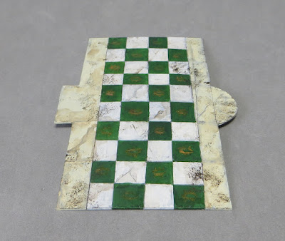
| I forgot to put this in the picture at the start, but this is the piece that hopefully joins everything else together. It's simply plasticard, scored to look like a tiled walkway. |
So, what does this lot look like when you add it to the homestead? I'm glad you asked! Pretty cool, I think!
The added bonus, is that I can still use all the elements in scenic shots. For example, perhaps inside a different astropathic building:
One day, I hope to have a fully exclusive temple for my astropaths, but for the meantime, this little accessory set will keep me going!
As a final note, here's the temple itself being used in-game (Arbites are attempting to protect the Astropaths from the clutches of a menacing Genestealer cult):


Very nice!
ReplyDeleteI might have to steal some of these ideas for my Sisters. :)
Should be very easily adaptable for sisters I reckon :)
DeleteI need an emoji worth a jaw dropped to express my feelings for this!
ReplyDeleteGlad you like it :D
DeleteFantastic mate, that is a really smart approach to scenery, and the end result is both cool and flexible... I think you've just invented cooxible!
ReplyDeleteWatch for a launch of cooxible scenery later in the year. I'm off to trademark it now :P
DeleteInspirational, you've really captured the aesthetic excellently here and the use of different bits and pieces all comes together so well.
ReplyDeleteThanks Stuart! I've got a box of bits I throw stuff in just in case. It's nice to pull some out every now and then :)
DeleteReally good ideas. Well implemented. It's given me some new ideas, cheers!
ReplyDeleteYou're welcome! Make sure you share pics of anything you end up making :)
Deletehey that is great! The two rackham statue pillars with lights are really a great conversion, and there are tons of fantasy pillars out there that you could convert in a similar manner.
ReplyDeleteIt seems like the sides of the building need something too. You have a round building with multiple doors, but only the first one is "dressed" for this setting. Maybe a few more of those freestanding banners, or some column fencing or something could help make it more of a temple complex. (futuristic garden dome?)
Thanks :) I'd like some walkways lined with similar statues, and a walled courtyard is on the agenda. Some planters, perhaps a raked gravel garden? Who knows, perhaps a larger complex covering a full table?
DeleteOutstanding way to get more use out of an already great bit of scenery.
ReplyDeleteThe tiled floor is my fav bit - such a simple concept, but it looks so good!
Seeing your stuff all laid out on the game table is a joy to pore over btw.
Thanks Dai! It was all quickly assembled, but I'm glad you think it all works together.
DeleteIt's nice to be at the point where I can fill a table :)
This is top stuff, I think the only thing they could wish for is a certain flying disc... ^^
ReplyDeleteIt will happen!
DeleteModular is best :)
ReplyDeleteModular suits me certainly. Different looks with small changes, plus easier to store :)
DeleteIt's funny, I'm working on almost the exact same kind of thing for my RT project March game. But my stuff is not a patch on yours. It's a very clever use of a few bits to really create a distinctive setting. Bravo!
ReplyDeleteI love the idea that you're making similar stuff. It makes me think we're channelling the same influences. Looking forward to seeing you results :)
DeleteOh gloriously good stuff.
ReplyDeleteAll in the name of keeping the Imperium going :)
DeleteIndeed, the two statues with the lamps have a quite Deco look to them to my eye. They really stand out. :) Lovely bit. Nice to see it's all add on stuff.
ReplyDeleteIt's the glass opaline lights, right? Something about graceful statues too. Glad you like them :)
DeleteSir, these are the details that turn a brilliant project into a genius one. Congrats, really, I love what you did here!!
ReplyDeleteThanks Suber! Very kind :)
DeleteVery cool indeed!
ReplyDeleteGlad you like it :)
DeleteThose figures are brilliant!
ReplyDeleteThanks Gordon :)
DeleteThe terrain looks just right in that it's detailed enough to have that wow factor but not too detailed as to detract from the miniatures in play. Nice.
ReplyDeleteThanks very much :)
Delete
ReplyDeleteThats using your head, working smarter not harder. Fantastic.
Flexible and multi functional is a watchword I should permanently apply I think :)
Delete