Illustrations of Imperial architecture are pretty rare in the Rogue Trader rulebook. Yes, there's the fantastic spread of Helsreach illustrations as well as the Emporer's Palace, but for the rest of the book we only see glimpes of background shapes, walls, ruins or ductwork.
I was delighted to see Tony Ackland's brilliant unpublished* Rogue Trader townscape when he put it up on Facebook a little while ago. The image shows a backwater frontier town complete with rickety shacks, landing pad and an imposing block house festooned with gibbet, observation cameras and spikes.
*correct me if I'm wrong.
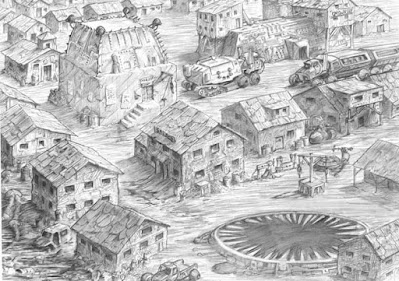 |
| Illustration by Tony Ackland. |
The townscape is pretty close to the terrain set that I've been pulling together, so once again I roped Graham at Grimsforge in to build me a block house based on Tony's illustration.
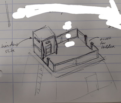 |
| Midway through the build I asked Graham to add a removable top piece for the block house. |
Graham did a fabulous job and created a lovely large and imposing building for me:
I decided that I wanted the block house to be a more ominous and imposing colour than my existing buildings, so I gave it a black and grey colour scheme that matches my Inquisitional commandos.
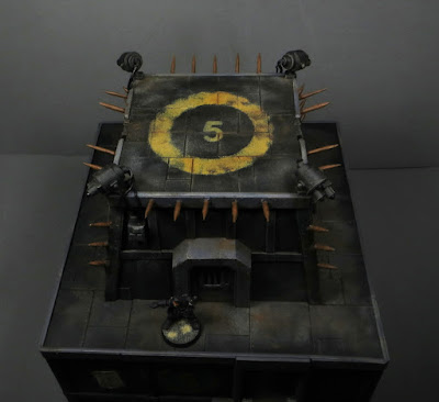 |
| If I leave the top piece off, I have a nice landing pad for a land speeder or small shuttle. |
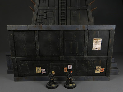 |
| Some wanted posters and proclamations evoke Tony's illustration. |
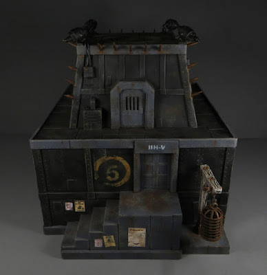 |
| A removable gibbet as another nod to the original illustration. |
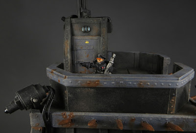 |
| The top piece makes a nice viewpoint. |
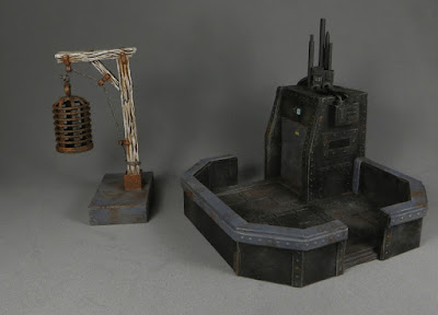 |
| The gibbet is a Wizkids piece that I added to a plasticard stand. |
Very pleased with how the final building looks and looking forward to using it as an objective building to dominate a future game!
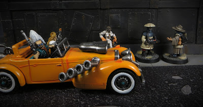 |
| I left one of the sides relatively blank so it can act as a street scene backdrop! |


Wow! This looks like something straight out of Brazil.
ReplyDeleteI couldn't hope for a better comparison! Thanks 😊
DeleteThanks Jimmy! I hadn't had the car out for a while - it seemed just the sort of ride to burn rubber in the faces of the regime!
ReplyDeleteThat does look suitably threatening. You'll have to give us a townscape of your own with all the kit you've amassed.
ReplyDeleteIt's on the to do list, in fact I've even taken some pics. Full town shots in the next week 🙂
DeleteAnother fantastic building! Love the coloring choice to make it stand out. The Alternative top was a great addition as well! The Provincial town has Law and Order now! (Well, the law is there anyway.)
ReplyDeleteOne question... is that a landing pad or a giant mouth?
It had never occurred to me that it might be a mouth of a giant sand dwelling pit beast!!
DeleteGlad you like the new build.
I love that it's a nice centerpiece but also can connect to many other elements. The playability of those late buildigs of yours is also very appreciable.
ReplyDeleteGlad you like it JB. It was great to get a piece that we could fit with the aesthetic of all the other buildings as well as be a retro reference at the same time. Of course no-one would dare to make a walkway across to this particular building from an adjacent one!
DeleteGreat stuff as always! The two of you really have a system going here. And I completely missed that illustration over on Facebook. Lord, but that's fun. I love the big mine/factory building in the background with the signage on it and the armored off-road semis/HGVs out front. A little heavy industry really adds to the flavor. It still looks like a poor, frontier town, but it's not just a small one anymore; more Leadville than Deadwood. Fantastic stuff! And thank you for sharing this. :)
ReplyDeleteIt's been a really fun creative process working on the designs then seeing them realised so brilliantly. I'm a huge fan of the illustration - packed full of details and just the sort of place I want to use as the setting for my games.
DeleteTruly great piece ! It ties nicely with the other buildings while giving a more threatening vibe. Can't wait for the post with the fully poulated (buildings and miniatures) board :D
ReplyDeleteThanks Merlin! It's definitely a part of town you want to avoid if you have anything to hide.
DeleteBloody lovely looking and imposing at that!
ReplyDeleteCareful you don’t put out an eye on those spikes mind!
Thanks Dai! I have already made a mental note to watch out for those spikes!!
DeleteI'm such a fan of all this! From the inspiration to the paintjob, going through the design and the building of the structures. What an awesome job!
ReplyDeleteThanks Suber! Really glad you like the final product as well as the process 😊
DeleteFantastic - a pleasing retro reference and a great result in and of itself too, should be very useful in many games.
ReplyDeleteThanks Kym. I'm a big fan of a solid retro reference!
DeleteThe settlement in that illustration looks run down and dismal :)
ReplyDeleteBeautifully done base for some proper enforcement!
It's got the vibe of a western boom town - more effort spent on plundering a valuable resource than town planning.
DeleteGlad you like the blockhouse 🙂